Reynolds Consumer Products
Reynolds Executive Development Logo
For this logo, I was asked to create something that gave the feel of the word “executive” without it necessarily having to say “executive”. Although, the end result does say “Reynolds Executive Development” I believe that it would still look professional without having that title within the logo. This logo was to use the classic Reynolds Consumer Products Globe from their original logo but in a different way than usual. This is why I decided to have the text wrap around and overlap it.
Engineering Leadership Development Program Logo
This logo was created for the Engineering Development Program at Reynolds Consumer Products. It was a redesign of their previous logo, that had very little personality. This design includes equipment that the engineers in this program will actually use as well as one of the products that they would develop. This program is a two year program for college students to join to be introduced to what it is like working full time in engineering and what they would be doing on a daily basis, that is then usually translated into a full time job at RCP.
Diversity, Equity & Inclusion
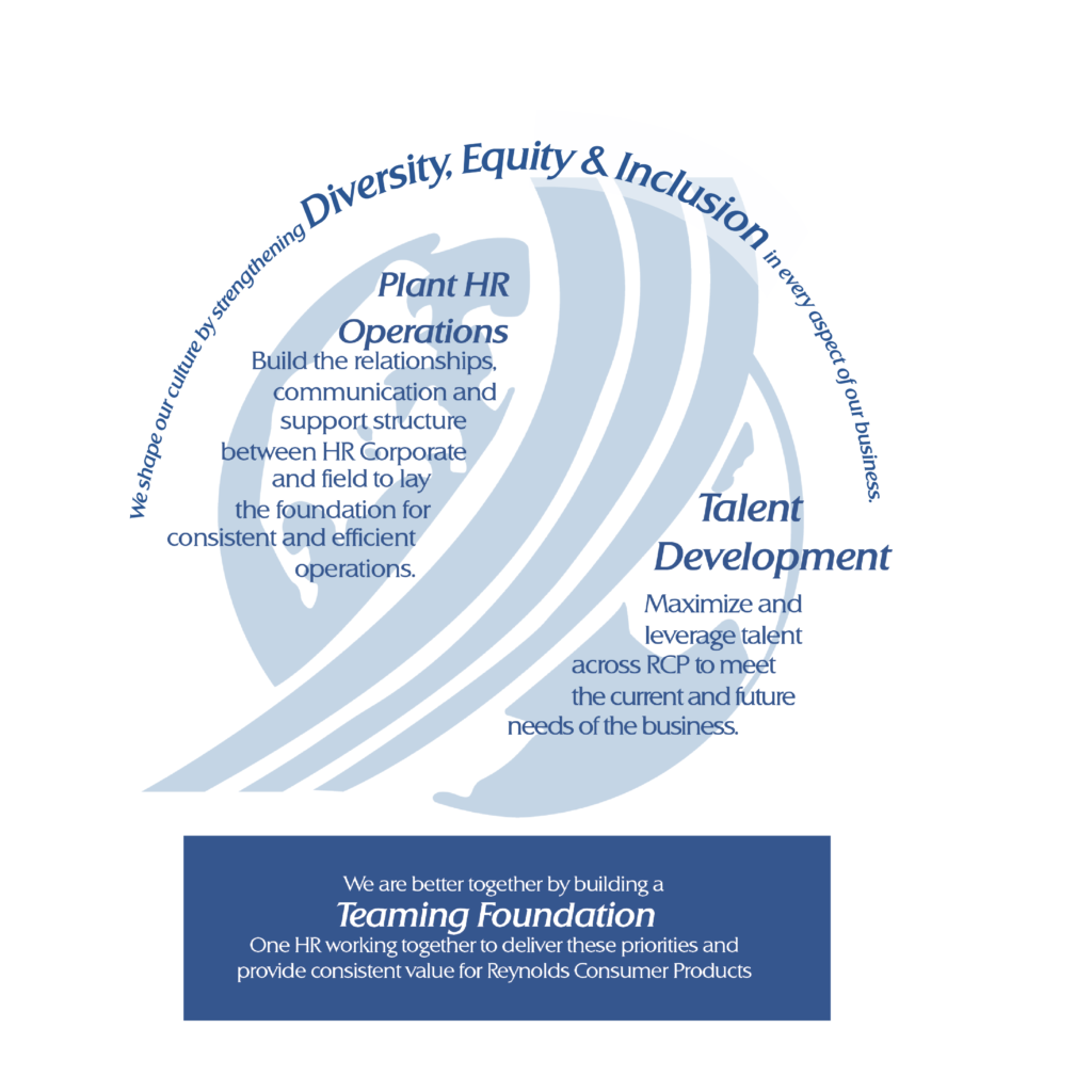
This page was designed to be used in presentations for Human Resources. It is meant to be a reminder of the general priorities that the company is dedicated to following. They wanted to emphasize the idea of Diversity, Equity, and Inclusion, and focus specifically on Plant HR Operations and Talent Development. They wanted this to be a reminder to everyone who sees it at the office that these are the practices they should be following.
Manufacturing Day Social Media Post
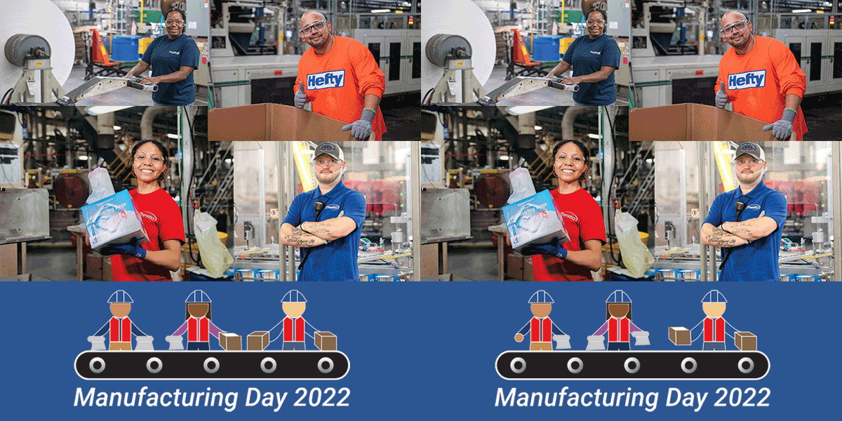
This is a post used on social media for Manufacturing Day. Manufacturing day is a day when Reynolds goes to local high schools near all of their plants and advertises the manufacturing business to those who think that college is not their next step. This design was originally created as a static logo to go on a t-shirt and then developed into a gif to go under the photos of employees. The goal of this logo was to create something that people would want to continue to wear after manufacturing day but also to represent the diversity within the company.
Reynolds Consumer Products HR Strategy
This one pager was designed to be printed and hung up at people’s desks at RCP. It includes the Diversity, Equity, and Inclusion design as well as the Mission statement, and the company’s priorities. The goal of this design was to be a bright and recognizable print out to remind those who pass by it what the company stands for.